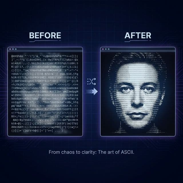
Most ASCII art looks terrible. Blurry blobs. Unrecognizable faces. Walls of random characters that could be anything.
That is not a tool problem. It is a settings problem.
The difference between garbage output and clean, professional text art comes down to five decisions you make before you hit convert. This guide covers each one, with specific numbers, so you stop guessing and start producing results worth sharing.
Quick version: Open the ASCII Art Generator, upload your image, set contrast to +20, pick the right width, and convert. You will get better output than 90% of people on your first try.
Why most ASCII art looks like noise
Here is what happens when someone converts an image without thinking about settings.
They upload a busy photo. They leave width at the default. They ignore brightness and contrast. They hit convert. The output is a rectangle of characters with no visible subject.
The core issue: the algorithm maps pixel brightness to characters. If your source image has narrow brightness ranges, similar textures everywhere, or a cluttered background, every pixel maps to nearly the same character. The result is visual noise.
The fix is not a better tool. The fix is giving the tool better input and using the controls that are already there.
Setting 1: pick the right width
Width controls how many characters appear per line. It is the single biggest factor in output quality.
Rules:
- 40 to 60 characters for simple shapes, logos, and icons. Clean, minimal output.
- 80 characters for general use. This is the standard terminal width and a safe default.
- 100 to 120 characters for portraits and detailed photos. You need the extra resolution to capture facial features.
- 150 to 200 characters for maximum detail. Only useful in wide terminals or code editors.
The mistake most people make: using high widths on simple images. A logo at 200 characters wide has so much empty space between edges that it loses all impact. Match the width to the complexity of the source image.
Try it now with the ASCII Art Generator. Upload a logo at 60 characters, then the same logo at 150. The difference is obvious.
Setting 2: increase contrast before you convert
This is the setting that separates good output from great output.
Most photos have compressed dynamic range. Shadows are muddy. Highlights are soft. When the ASCII converter maps those narrow brightness values to characters, everything blends together.
Increasing contrast widens the gap between light and dark. Shadows get darker. Highlights get brighter. The subject separates from the background.
Start with contrast at +15 to +30. That range works for 80% of photos.
For high-key images (mostly bright, like product photos on white backgrounds), try +40 to +50.
For images that already have strong contrast (like silhouettes), leave it at 0 or go slightly negative to preserve midtones.
The ASCII Art Generator has a contrast slider built in at the tool level, so you do not need to open Photoshop, GIMP, or any other editor. Adjust it, convert, and compare.
Setting 3: fix brightness for dark or overexposed images
Brightness shifts every pixel up or down on the lightness scale.
- Dark photos (indoor shots, night scenes): slide brightness to +15 to +30. This lifts the shadows so the converter can distinguish detail.
- Overexposed photos (washed out, too bright): slide brightness to -10 to -20. This recovers some tonal range in the highlights.
Brightness and contrast work together. If you push contrast high, you may need to adjust brightness slightly to keep the midpoint where you want it.
A common workflow: set contrast first, then nudge brightness until the output looks balanced.
Setting 4: choose the right character set
Not all character sets are equal. The one you pick changes the texture, density, and compatibility of your output.
Standard: @%#*+=-:.
The default. Ten characters covering the full brightness range. Works on every platform, every font, every terminal. If you are sharing ASCII art in a README, email, or chat message, use this.
Simple: #*-.
Five characters. Less tonal range, but cleaner output. Use this when you want minimalism or when your source image has very few brightness levels (like a logo or line drawing).
Blocks: █▓▒░
Unicode block characters. Maximum density, highest contrast. The output almost looks like a low-resolution bitmap. Best for dark-mode terminals and environments that support Unicode.
When blocks fail: some terminals, email clients, and chat platforms do not render Unicode block characters correctly. If your output looks broken, switch to Standard.
Setting 5: use edge detection for logos and architecture
Edge detection is underrated for ASCII art. It applies a Sobel filter that strips away all tonal information and keeps only the outlines.
When to use it:
- Logos, icons, and text-heavy images
- Architectural photos and geometric structures
- Any image where you want line art instead of shaded tones
When to skip it:
- Portraits (you lose all facial shading)
- Landscape photos (you lose depth and atmosphere)
- Low-contrast images (edges are too faint to detect)
If edge detection output looks too faint, increase contrast to +30 or higher before enabling it. The Sobel filter needs strong edges to work with.
Try this: upload a photo of a building to the ASCII Art Generator, enable edge detection, and set width to 100. The result looks like a technical drawing rendered in text.
Setting 6: invert colors when the subject is dark
Invert flips every pixel value. Black becomes white ands white becomes black.
Most ASCII art assumes light characters on a dark background (because terminals are dark). If your source image has a dark subject on a light background (like dark text on a white page), the output maps the subject to sparse characters and the background to dense ones. The result is backwards.
Invert fixes this in one click. Use it when:
- Your subject is darker than the background
- You are pasting into a dark terminal and the output looks washed out
- You want to flip the visual emphasis
The settings cheat sheet
| Image type | Width | Contrast | Brightness | Edge detection | Character set |
|---|---|---|---|---|---|
| Logo or icon | 50 to 70 | 0 to +10 | 0 | Optional | Standard or Simple |
| Portrait | 100 to 120 | +15 to +30 | 0 to +10 | Off | Standard |
| Architecture | 80 to 120 | +20 to +40 | 0 | On | Standard |
| Silhouette | 60 to 80 | 0 | 0 | Off | Standard |
| Dark photo | 80 to 100 | +20 | +15 to +30 | Off | Standard |
| Terminal banner | 40 to 60 | +10 | 0 | Off | Blocks |
How to export and share ASCII art
Once your output looks good, you have three export options.
Copy to clipboard
The fastest path. Click Copy, then paste into your terminal, code editor, README, or chat message. Make sure the destination uses a monospace font or the alignment breaks.
Download as text file
Click Download to save a .txt file. This preserves the exact formatting. Open it in any text editor with a monospace font and it renders perfectly.
Save as PNG
Click Save as PNG to render the ASCII text onto a canvas and export it as an image. This is the best option when:
- You are sharing on a platform that does not support monospace text (Instagram, Twitter, LinkedIn)
- You want a visual preview for a portfolio or presentation
- You need to embed the result in a slide deck or document
Preparing images for better ASCII art
The best ASCII art comes from well-prepared source images. Before you upload, consider these steps.
Remove the background
A busy background competes with the subject. The Background Remover strips it away, giving the converter a clean subject to work with.
Resize large images
A 4000px photo does not produce better ASCII art than a 1000px photo. The converter downsamples everything to your target width anyway. But large files take longer to process. Use the Image Resizer to bring the file size down before uploading.
Convert to the right format
The ASCII Art Generator accepts JPG, PNG, and WebP. If your source image is in another format, start with the Image Conversion hub and choose the path you need before you come back here.
Increase contrast in the source
If you want even more control than the built-in slider, pre-process your image in an editor and then upload the adjusted version. Stacking contrast at both stages can produce more dramatic results for artistic projects.
Common mistakes (and how to fix them)
Mistake 1: converting a busy photo at low width
A complex scene at 60 characters is unrecognizable. Either increase the width to 120+ or simplify the image first (crop, remove background, increase contrast).
Mistake 2: ignoring the font
ASCII art only renders correctly in monospace fonts. If you paste it somewhere that uses a proportional font (like a Google Doc with the default font), the alignment shatters. Switch to Courier New, Consolas, Monaco, or JetBrains Mono.
Mistake 3: using blocks in incompatible environments
Block characters (█▓▒░) look incredible in terminals but break in email clients, SMS apps, and some chat platforms. Test your target platform before committing to blocks.
Mistake 4: not bumping contrast
This is the single most common reason ASCII art looks flat. Even +15 on the contrast slider makes a noticeable difference in character variation. Test it.
Where to use ASCII art
- README files. Place an ASCII banner at the top of your GitHub repo. It renders in every browser, every code editor, every terminal. Zero dependencies. Big Text Generator handles text banners. The ASCII Art Generator handles images.
- Terminal splash screens. CLI tools with an ASCII logo feel finished. Drop the output into your shell script and it prints on every startup.
- Discord and Slack. Both platforms render monospace code blocks. Wrap your ASCII art in triple backticks and it displays perfectly.
- Email signatures. A small ASCII logo in plain-text email renders in every client. No image hosting. No blocked attachments.
- Creative projects. Use ASCII art as textures, backgrounds, or decorative elements. The PNG export makes it easy to embed in designs.
Extract text from images (the reverse direction)
If you want to go the other direction (extracting text from an image instead of converting an image into text art), use the Image to Text (OCR) tool. It reads characters from screenshots, scans, and photos and outputs copyable text you can paste anywhere.
Related tools
- ASCII Art Generator to generate text art from any image
- Background Remover to clean up source images before converting
- Image Resizer to resize and compress images before processing
- Big Text Generator for text-based ASCII banners
- Bubble Text Generator for stylized Unicode text
- Image Conversion hub to prep unsupported image formats before converting
- Image to Text (OCR) to extract text from images
Privacy
All processing happens in your browser. When you use the ASCII Art Generator, your image is drawn onto a local HTML Canvas element, processed in memory, and discarded when you close the tab. Nothing is uploaded. Nothing is stored.